CONCRETE
GEOMETRY
Architectural forms rendered in ink. Clean lines meeting brutal mass. The intersection of precision and power.
Featured
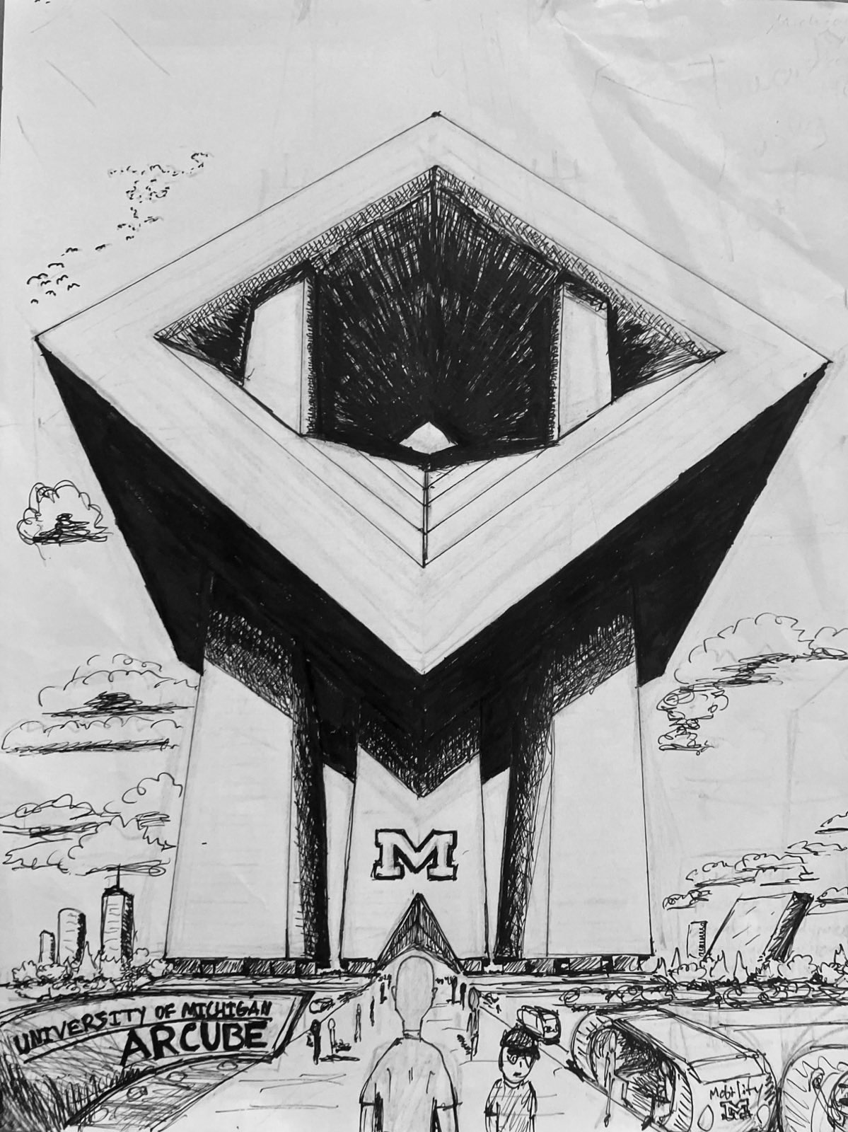
University of Michigan Arcube
Ink on paper
DESIGN DECISIONS
TYPOGRAPHY
Gotham was chosen for its institutional authority and geometric precision. Originally designed for architectural signage, it embodies the same principles as brutalist architecture: function over ornamentation.
The weight hierarchy is deliberate: Black for major statements, Bold for structure, Light for readable content. No decorative typefaces. No serifs. Only what serves the message.
SCALE AS HIERARCHY
7xl headlines command attention. 5xl for major sections. 2xl for subsections. Size determines importance, not color or decoration.
COLOR THEORY
Three colors only: Pure white (#fefefe), deep black (#0a0a0a), and minimal gray (#e8e8e8) for shadows. This mirrors the monochromatic nature of ink drawings.
No accent colors. No brand colors. No emotional manipulation through hue. Maximum contrast ensures accessibility while forcing focus on content hierarchy.
SHADOW STRATEGY
8px offset shadows create depth without gradients. Hard edges maintain the architectural aesthetic. Shadows serve function, not beauty.
LAYOUT PRINCIPLES
Grid-based architecture reflects the geometric precision of the featured drawings. No organic curves. No asymmetrical balance for its own sake.
White space is generous but calculated. 32-unit spacing between major sections. 16-unit gaps in grids. Every measurement serves readability and visual breathing.
ARTWORK PRESENTATION
Clean white backgrounds let ink drawings speak. Minimal borders define space without competing. No decorative frames.
WHAT WE REJECTED
No comic elements: Speech bubbles, halftone patterns, and cartoon typography were removed. The work is architectural documentation, not comics.
No textural backgrounds: Paper textures and aged effects were eliminated. The screen is not paper. Digital honesty over skeuomorphism.
BRUTALIST PHILOSOPHY
"Truth to materials" — the interface reveals its digital nature. No attempts to mimic print. Form follows function, always.
URBAN STUDIES
TRANSIT HUB
The rhythm of departure and arrival. How transportation architecture shapes movement through space.
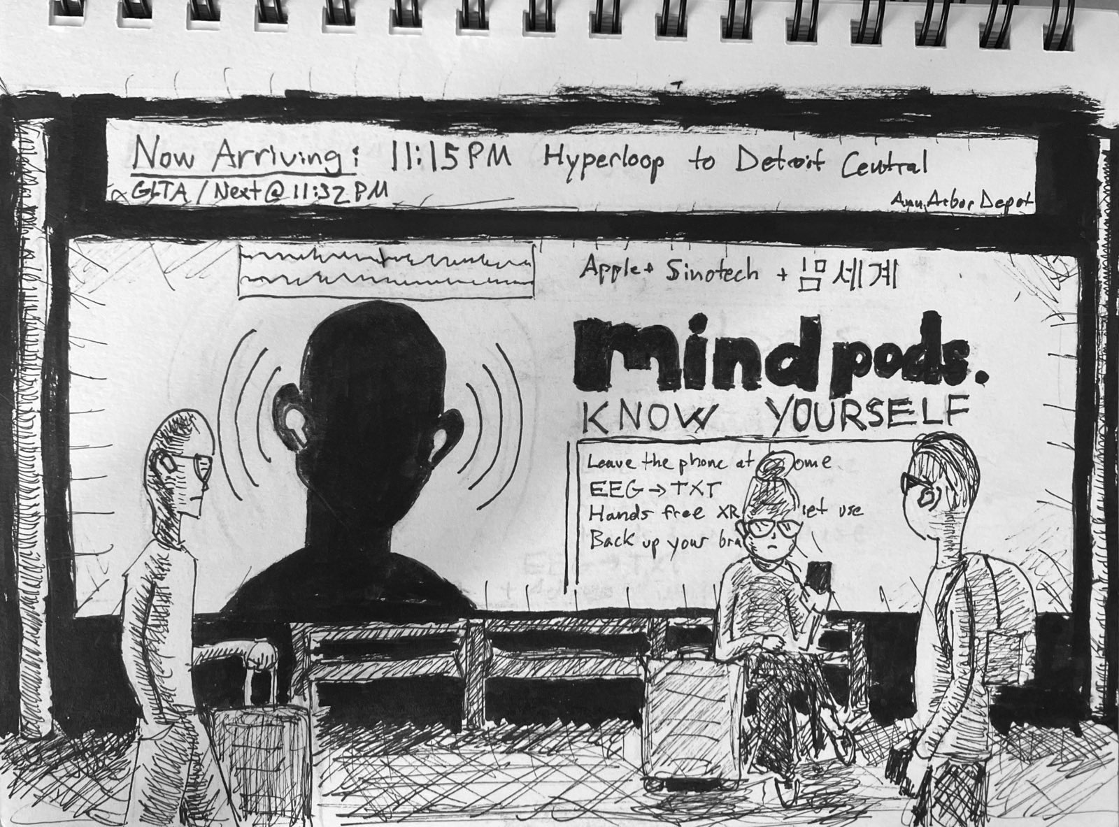
Ann Arbor Station
Ink study
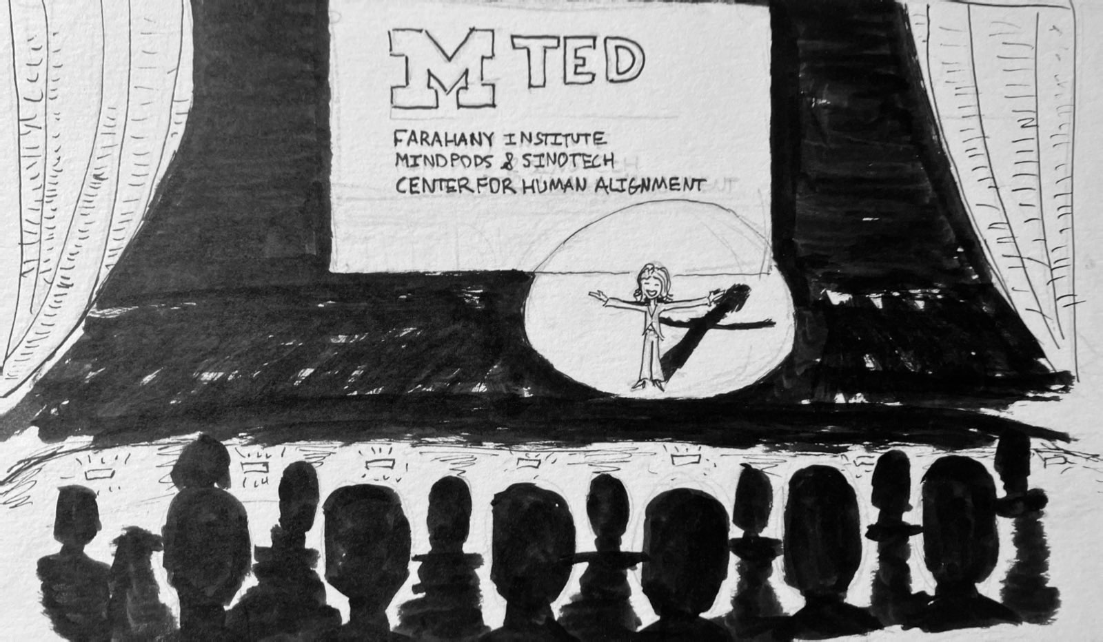
LEARNING SPACE
Future educational environments. Technology and human interaction creating new possibilities.
Mindpods Concept
Ink study
PROCESS
Each drawing begins with direct observation. Sketching on location, capturing not just the geometry of space but the rhythm of people moving through it.
The ink becomes a bridge between architectural precision and human storytelling. Every line carries intention. Every shadow tells a story.
TECHNIQUE
Pilot G2 0.7mm pen
Strathmore Bristol paper
Single-point perspective
Controlled line weight
INFLUENCES
Hergé — Clean line mastery
Katsuhiro Otomo — Architectural detail
François Schuiten — Urban dreamscapes
Naoki Urasawa — Human observation