SPATIAL NARRATIVES
How architecture shapes the stories we tell and the memories we make within constructed spaces.
Design Notes
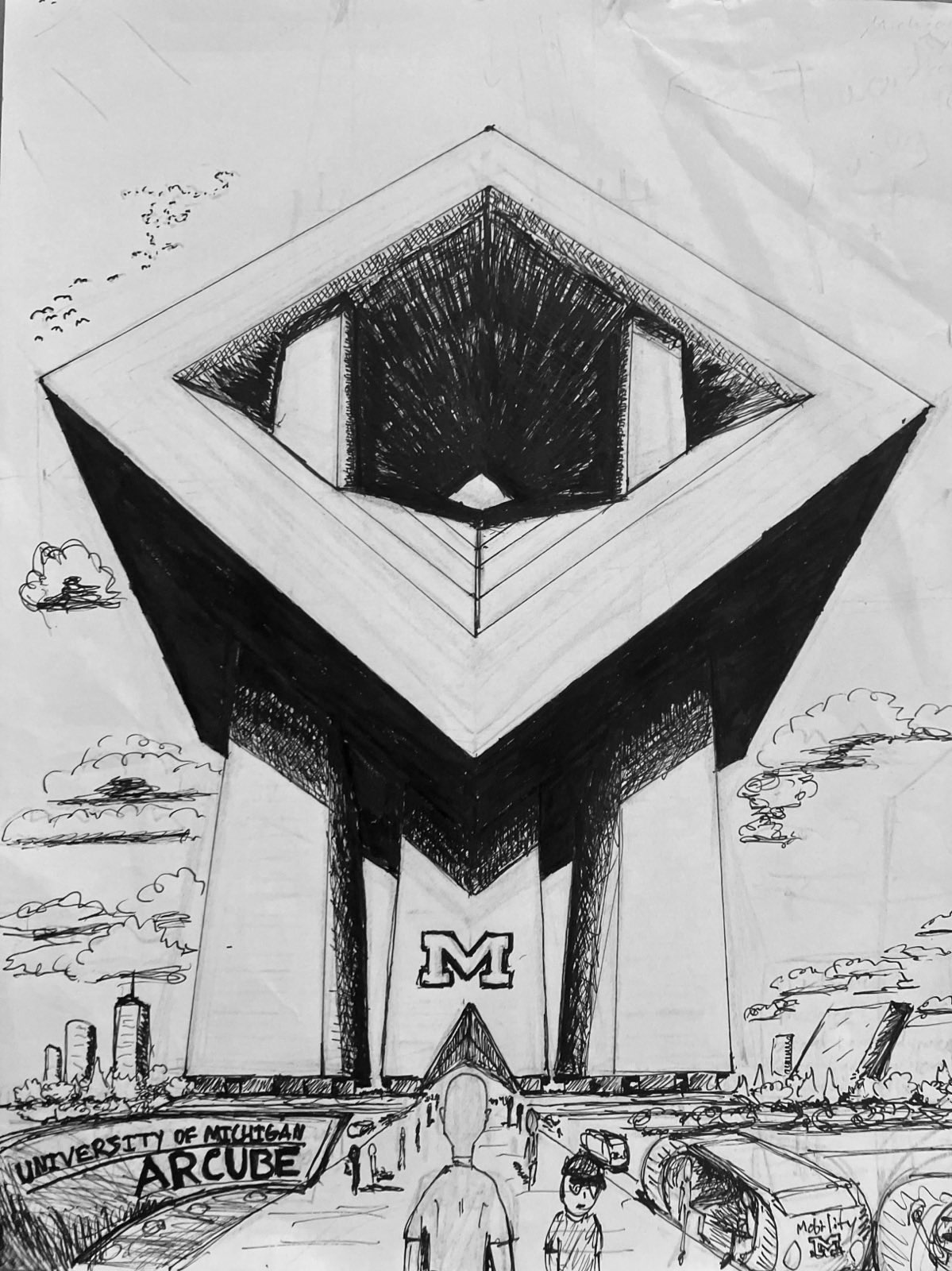
- • Hero image establishes visual hierarchy
- • Overlay text creates depth
- • Asymmetric grid balances content
- • White space provides breathing room
The relationship between image and text in zine design isn't merely decorative—it's architectural. Each element must serve the narrative while maintaining visual coherence. The hero image anchors the spread, providing both context and emotional resonance.
Notice how the overlaid text doesn't compete with the image but enhances it. The semi-transparent overlay ensures readability while preserving the photograph's impact. This technique works particularly well for establishing mood and setting.
ORGANIC INTEGRATION

Text flowing around images creates an organic, magazine-like quality that's essential to good zine design. The key is managing the relationship between the text column width and image placement to maintain readability while creating visual interest.
This technique works best when the image relates directly to the adjacent text. The reader's eye naturally moves between image and text, creating a unified reading experience. The wrap creates negative space that gives both elements room to breathe.
Consider the text line length carefully—too narrow and reading becomes choppy, too wide and the text loses its connection to the image. The optimal measure depends on your typeface choice and overall page proportions.
"The best zine layouts feel inevitable—as if the images and text naturally arranged themselves into the perfect configuration."
The floating initial cap (drop cap) at the beginning creates a strong entry point and adds typographic texture. It's a classical technique that works particularly well in zines because it adds handmade, crafted quality to digital layouts.
MODULAR COMPOSITION

COLLABORATIVE SPACES
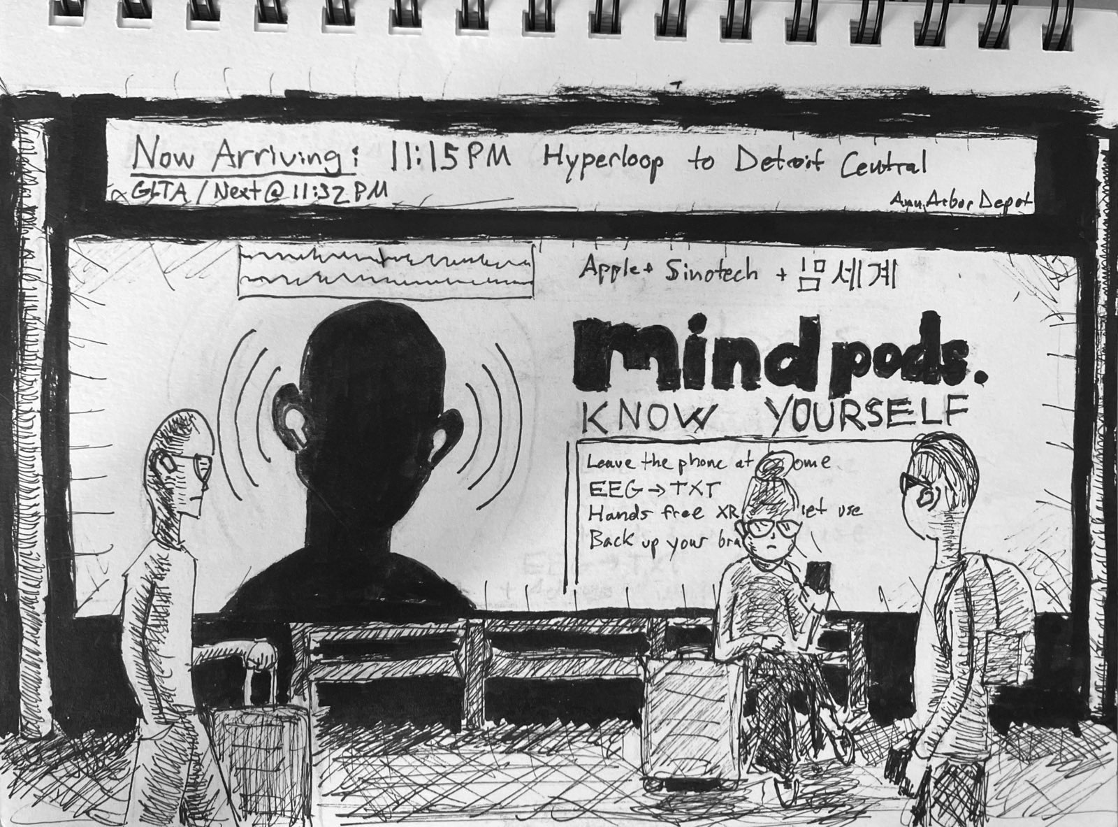
Modern workspaces blur the boundaries between public and private, formal and casual. These hybrid environments require new approaches to both design and documentation.
The grid system provides structure while allowing for dynamic layouts. By working within a modular framework, you can create complex compositions that still feel cohesive.
This approach is particularly effective for zines that mix different types of content— interviews, photo essays, illustrations, and experimental text.
"Grids liberate rather than constrain—they provide the foundation for creative freedom."
Polaroid-style treatment adds personality
Torn edge effect for DIY aesthetic
Technical Implementation
Image Sizing
Use consistent aspect ratios within each spread. Mix portrait and landscape orientations for visual rhythm.
Text Hierarchy
Establish clear levels: headlines, subheads, body text, captions. Maintain consistent spacing between elements.
White Space
Don't fill every pixel. Strategic emptiness guides the eye and creates emphasis.
EXPERIMENTAL FORMS

Rotation and transformation can break up rigid layouts and add energy to static pages.
Zines give you permission to experiment. Try unconventional angles, overlapping elements, and asymmetric compositions. The DIY aesthetic embraces imperfection and spontaneity.
TYPE
Sometimes text becomes the image. Large-scale typography can create powerful visual impact while still conveying meaning. Consider text as both content and graphic element.
Technical elements can add texture and meaning
SPACING REFERENCE
Vertical Rhythm
Section Spacing: 3rem (48px)
Large breaks between major content sections
Paragraph Spacing: 1.25rem (20px)
Comfortable reading rhythm for body text
Element Spacing: 1rem (16px)
Between related elements like images and captions
Tight Spacing: 0.5rem (8px)
Within grouped elements or list items
Image Guidelines
Full Bleed
Images that extend to page edges create impact
Contained
Images within margins feel more integrated
Floating
Images that break column boundaries add dynamism
TYPOGRAPHY PAIRINGS
Inter + Crimson Text
Modern sans-serif headlines paired with classical serif body text. Excellent for contemporary zines with literary content.
Current combination used in this demo
Mono + Serif
Monospace headlines create technical, DIY aesthetic. Works well for zines about technology, process, or craft.
Tech-forward, handmade feel
All Serif
Using different weights and styles of the same typeface creates subtle hierarchy and classical elegance.
Unified, literary aesthetic